Cascading Style Sheets (CSS) Flexbox is a powerful layout model that provides a more efficient way to design and structure user interfaces. Understanding and mastering Flexbox is essential for front-end developers to create responsive and dynamic web layouts. In this comprehensive guide, we will explore the fundamentals of CSS Flexbox, discuss its key properties, and demonstrate how to leverage its capabilities to build flexible and responsive designs.
What is CSS Flexbox?
CSS Flexbox, or the Flexible Box Layout, is a layout model that allows the design of complex layouts and structures with ease. Unlike traditional models, Flexbox simplifies the process of creating dynamic and responsive designs by providing an efficient way to distribute space and align items.
Flexbox Fundamentals
1. Flex Container and Items
In Flexbox, there are two main components: the flex container and the flex items. The container is the parent element that holds the flex items. By applying the display: flex; property to the container, we activate the Flexbox layout.
.container {
  display: flex;
}
2. Main and Cross Axes
Flexbox introduces the concepts of the main axis and cross axis. The main axis is the primary axis along which flex items are laid out, and the cross axis is perpendicular to the main axis. You can control these axes using the flex-direction property.
.container {
  flex-direction: row; /* or column, column-reverse, row-reverse */
}
3. Justify Content
The justify-content property aligns flex items along the main axis. This property provides options such as flex-start, flex-end, center, space-between, and space-around.
.container {
  justify-content: space-between;
}
4. Align Items
The align-items property aligns flex items along the cross axis. It supports values like flex-start, flex-end, center, baseline, and stretch.
.container {
  align-items: center;
}
5. Flex Grow, Shrink, and Basis
Flex items have three main properties that control their behavior: flex-grow, flex-shrink, and flex-basis. These properties determine how items grow, shrink, and their initial size.
.item {
  flex: 1 0 auto;
}
Responsive Design with Flexbox
One of the significant advantages of Flexbox is its ability to create responsive designs with minimal effort. By adjusting flex properties and using media queries, developers can craft layouts that adapt to different screen sizes.
@media screen and (max-width: 600px) {
  .container {
    flex-direction: column;
  }
}
Browser Support
CSS Flexbox enjoys excellent browser support, making it a reliable choice for modern web development. However, it’s essential to check for specific properties and features if you need to support older browsers.
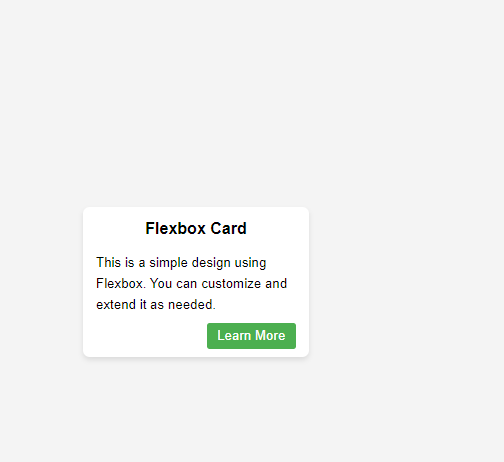
let’s create a simple design work using HTML and CSS Flexbox. We’ll design a basic card layout with some content. Here’s the code:
<!DOCTYPE html>
<html lang="en">
<head>
    <meta charset="UTF-8">
    <meta name="viewport" content="width=device-width, initial-scale=1.0">
    <title>Flexbox Design</title>
    <style>
        body {
            font-family: Arial, sans-serif;
            margin: 0;
            padding: 0;
            box-sizing: border-box;
            display: flex;
            justify-content: center;
            align-items: center;
            min-height: 100vh;
            background-color: #f4f4f4;
        }

        .card {
            width: 300px;
            padding: 20px;
            border-radius: 10px;
            box-shadow: 0 4px 8px rgba(0, 0, 0, 0.1);
            background-color: #ffffff;
        }

        .header {
            text-align: center;
            font-size: 24px;
            font-weight: bold;
            margin-bottom: 10px;
        }

        .content {
            line-height: 1.6;
        }

        .footer {
            margin-top: 10px;
            text-align: right;
        }

        .button {
            padding: 8px 16px;
            background-color: #4caf50;
            color: #ffffff;
            text-decoration: none;
            border-radius: 4px;
        }
    </style>
</head>
<body>
    <div class="card">
        <div class="header">Flexbox Card</div>
        <div class="content">
            <p>This is a simple design using Flexbox. You can customize and extend it as needed.</p>
        </div>
        <div class="footer">
            <a href="#" class="button">Learn More</a>
        </div>
    </div>
</body>
</html>
Here is the Outcome!
Conclusion
Mastering CSS Flexbox empowers developers to create flexible, responsive, and efficient layouts. By understanding the core concepts and properties of Flexbox, you’ll have a valuable tool for designing modern and user-friendly interfaces. Experiment with different configurations, explore advanced features, and elevate your web development skills with CSS Flexbox. Happy coding!
JavaScript objects and prototypes
How to pass parameters between components in react
About the Author