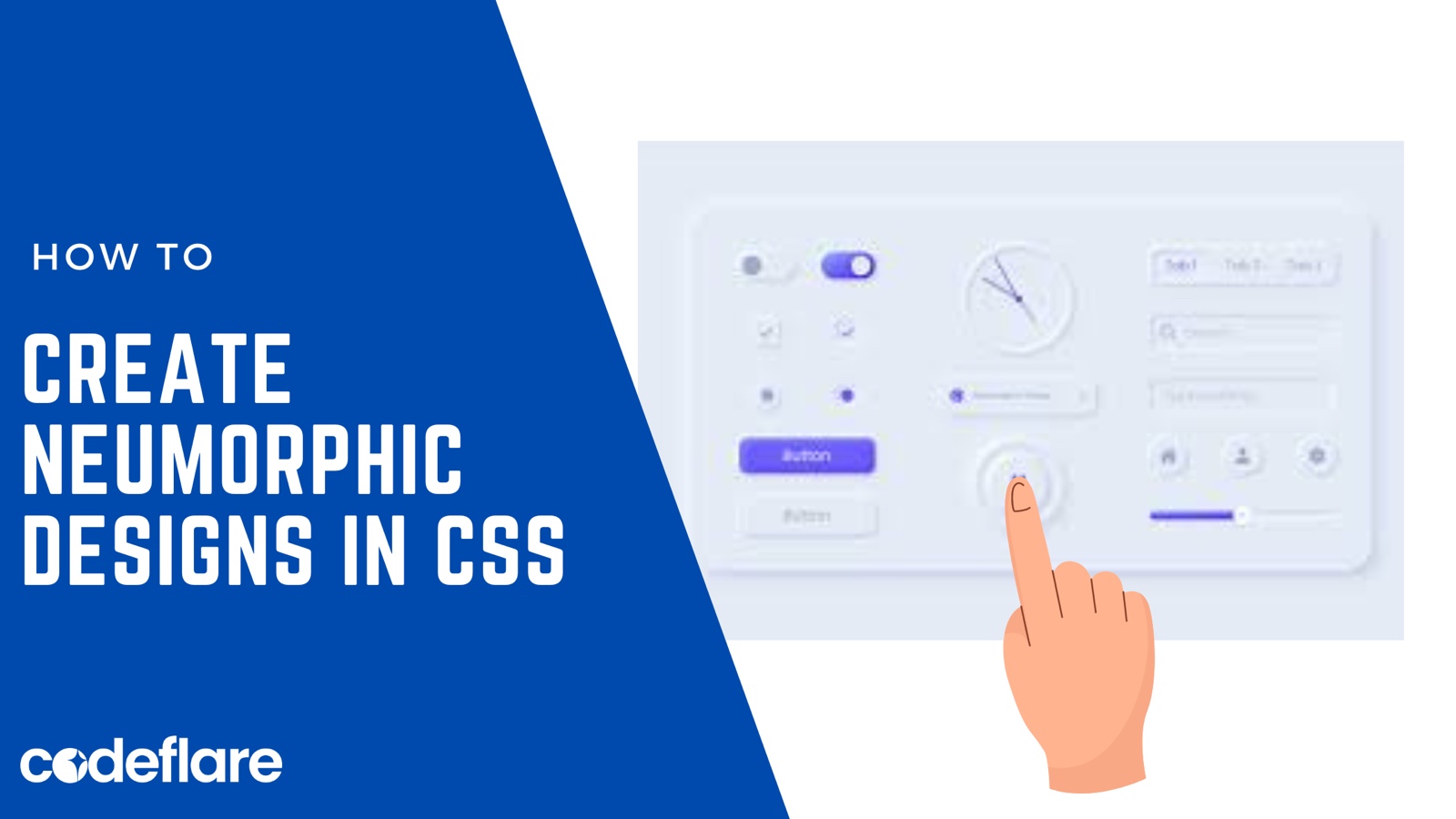
Neumorphism design, alternatively termed as “soft UI” or “new skeuomorphism,” represents a design trend that seamlessly integrates elements of skeuomorphism with contemporary minimalism. Its objective is to craft soft, tactile interfaces that not only captivate visually but also intuitively engage users. Throughout this article, we’ll delve comprehensively into the concept of Neumorphism, exploring its versatile applications across various industries. Additionally, we’ll provide concrete examples of Neumorphic designs and guide you through the step-by-step process of creating Neumorphic UI elements with insightful code examples.
Introduction to Neumorphism:
Neumorphism, characterized by its use of light and shadow to evoke a 3D effect on UI elements, imparts a soft and tactile appearance. Moreover, by employing subtle gradients, shadows, and highlights, it generates depth akin to objects casting shadows on a surface. However, unlike traditional skeuomorphism, which closely mimics real-world objects, Neumorphism emphasizes a futuristic yet familiar aesthetic.
Applications of Neumorphism:
Neumorphic design finds applications across various digital platforms, including mobile apps, websites, and desktop applications. Moreover, its soft, inviting appearance makes it particularly suitable for:
- User Interfaces: Neumorphic UI elements enhance the user experience by providing intuitive visual cues and a sense of realism. They are commonly used for buttons, sliders, input fields, cards, and navigation bars.
- Productivity Tools: Neumorphism can improve the usability of productivity tools such as task managers, note-taking apps, and project management software by creating visually engaging and easy-to-navigate interfaces.
- E-commerce Platforms: Neumorphic design can elevate the shopping experience on e-commerce websites by making product listings, shopping carts, and checkout processes more visually appealing and user-friendly.
- Dashboard Design: Neumorphism lends itself well to dashboard design, where it can enhance the readability of data visualizations, charts, graphs, and analytics widgets.
Examples of Neumorphism:
- Neumorphic Button:
<button class="neumorphic-button">Click Me</button>
.neumorphic-button {
  background-color: #f0f0f0;
  border: none;
  border-radius: 10px;
  box-shadow: 5px 5px 10px #bfbfbf, -5px -5px 10px #ffffff;
  padding: 15px 30px;
  font-size: 16px;
}
Below is the Outcome of the button!

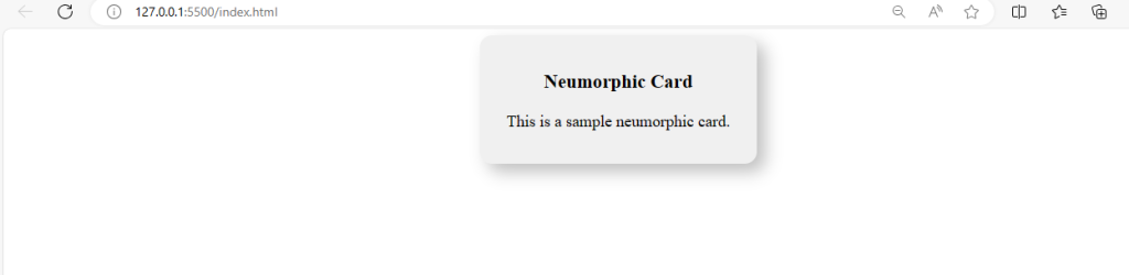
- Neumorphic Card:
<div class="neumorphic-card">
  <h3>Neumorphic Card</h3>
  <p>This is a sample neumorphic card.</p>
</div>
.neumorphic-card {
  background-color: #f0f0f0;
  border-radius: 15px;
  box-shadow: 10px 10px 20px #bfbfbf, -10px -10px 20px #ffffff;
  padding: 20px;
  width: 300px;
}
Below is the Outcome of the Card.!
- Neumorphic Input Field:
<input type="text" class="neumorphic-input" placeholder="Enter your name">
.neumorphic-input {
  background-color: #f0f0f0;
  border: none;
  border-radius: 10px;
  box-shadow: inset 5px 5px 10px #bfbfbf, inset -5px -5px 10px #ffffff;
  padding: 10px;
  font-size: 16px;
}
Below is the Outcome.!

4. Neumorphic Login design:
<div class="container">
    <h2>Login</h2>
    <form>
      <div class="input-container">
        <input type="text" placeholder="Username" required>
      </div>
      <div class="input-container">
        <input type="password" placeholder="Password" required>
      </div>
      <button type="submit">Login</button>
    </form>
  </div>
body {
font-family: Arial, sans-serif;
background-color: #f0f0f0;
display: flex;
justify-content: center;
align-items: center;
height: 100vh;
margin: 0;
}
.container {
background-color: #f0f0f0;
padding: 40px;
border-radius: 20px;
box-shadow: 10px 10px 20px #b7b7b7, -10px -10px 20px #ffffff;
}
.container h2 {
text-align: center;
margin-bottom: 20px;
}
form {
display: flex;
flex-direction: column;
}
.input-container {
margin-bottom: 20px;
}
input[type="text"],
input[type="password"] {
padding: 10px;
border: none;
background-color: #f0f0f0;
border-radius: 10px;
box-shadow: inset 5px 5px 10px #b7b7b7, inset -5px -5px 10px #ffffff;
}
button {
padding: 10px;
border: none;
background-color: #f0f0f0;
border-radius: 10px;
box-shadow: 5px 5px 10px #b7b7b7, -5px -5px 10px #ffffff;
cursor: pointer;
}
button:hover {
background-color: #e0e0e0;
}Here’s the full code:
<!DOCTYPE html>
<html lang="en">
<head>
<meta charset="UTF-8">
<meta name="viewport" content="width=device-width, initial-scale=1.0">
<title>Login Form</title>
<style>
body {
  font-family: Arial, sans-serif;
  background-color: #f0f0f0;
  display: flex;
  justify-content: center;
  align-items: center;
  height: 100vh;
  margin: 0;
}

.container {
  background-color: #f0f0f0;
  padding: 40px;
  border-radius: 20px;
  box-shadow: 10px 10px 20px #b7b7b7, -10px -10px 20px #ffffff;
}

.container h2 {
  text-align: center;
  margin-bottom: 20px;
}

form {
  display: flex;
  flex-direction: column;
}

.input-container {
  margin-bottom: 20px;
}

input[type="text"],
input[type="password"] {
  padding: 10px;
  border: none;
  background-color: #f0f0f0;
  border-radius: 10px;
  box-shadow: inset 5px 5px 10px #b7b7b7, inset -5px -5px 10px #ffffff;
}

button {
  padding: 10px;
  border: none;
  background-color: #f0f0f0;
  border-radius: 10px;
  box-shadow: 5px 5px 10px #b7b7b7, -5px -5px 10px #ffffff;
  cursor: pointer;
}

button:hover {
  background-color: #e0e0e0;
}
</style>
</head>
<body>
<div class="container">
<h2>Login</h2>
<form>
<div class="input-container">
<input type="text" placeholder="Username" required>
</div>
<div class="input-container">
<input type="password" placeholder="Password" required>
</div>
<button type="submit">Login</button>
</form>
</div>
</body>
</html>
Here’s the outcome:

Creating Neumorphism:
To create Neumorphic UI elements, follow these general steps:
- Choose Color Palette: Select soft, muted colors for your UI elements to create a subtle contrast between the background and the Neumorphic surfaces.
- Apply Shadows: Use box-shadow CSS property to apply shadows that mimic light and depth. Experiment with different shadow intensities and directions to achieve the desired effect.
- Add Highlights: Incorporate highlights using lighter shades to simulate light reflecting off the surfaces. These highlights create the illusion of convexity and depth.
- Fine-tune Depth: Adjust the depth of the shadows and highlights to achieve a balanced and cohesive Neumorphic appearance. Avoid excessive depth that may result in a cluttered or overwhelming design.
By following these steps and experimenting with different design elements, you can create stunning Neumorphic UIs that enhance user engagement and satisfaction.
Conclusion:
In summary, Neumorphism design epitomizes a distinctive fusion of realism and minimalism in UI design. Its soft, tactile aesthetics not only enhance visual appeal but also contribute significantly to user-friendliness. Moreover, by comprehending Neumorphism’s principles and applying them innovatively, designers can create immersive digital experiences that truly captivate users.
Hence, explore the possibilities of Neumorphic design and elevate your UIs to new heights of elegance and functionality. Moreover, With its versatility and aesthetic appeal, Neumorphism is poised to become a staple in the toolkit of UI/UX designers worldwide.
About the Author