Creating tabs and accordions with JavaScript can significantly enhance the usability and organization of your web content. This tutorial on JavaScript tabs and accordions will allow users to navigate and interact with different sections of your website efficiently. In this article, we’ll guide you through the process of creating both tabs and accordions using HTML, CSS, and JavaScript.
Introduction to Tabs and Accordions
Tabs and accordions are popular UI components used to organize content on a web page. Tabs allow users to switch between different sections of content without leaving the page, while accordions expand and collapse sections to reveal or hide content.
Creating Tabs
HTML Structure
First, let’s create the HTML structure for the tabs. We’ll have a container for the tab buttons and another for the tab content.
<!DOCTYPE html>
<html lang="en">
<head>
    <meta charset="UTF-8">
    <meta name="viewport" content="width=device-width, initial-scale=1.0">
    <title>Tabs and Accordions</title>
    <link rel="stylesheet" href="styles.css">
</head>
<body>
    <div class="tab-container">
        <div class="tab-buttons">
            <button class="tab-button active" data-tab="tab1">Tab 1</button>
            <button class="tab-button" data-tab="tab2">Tab 2</button>
            <button class="tab-button" data-tab="tab3">Tab 3</button>
        </div>
        <div class="tab-content active" id="tab1">Content for Tab 1</div>
        <div class="tab-content" id="tab2">Content for Tab 2</div>
        <div class="tab-content" id="tab3">Content for Tab 3</div>
    </div>

    <script src="scripts.js"></script>
</body>
</html>
CSS Styling
Next, let’s style the tabs to make them visually appealing.
* {
    box-sizing: border-box;
}

body {
    font-family: Arial, sans-serif;
    margin: 0;
    padding: 20px;
}

.tab-container {
    width: 100%;
    max-width: 600px;
    margin: auto;
}

.tab-buttons {
    display: flex;
    justify-content: space-around;
    margin-bottom: 20px;
}

.tab-button {
    padding: 10px 20px;
    cursor: pointer;
    background-color: #f1f1f1;
    border: none;
    border-radius: 5px;
    outline: none;
}

.tab-button.active {
    background-color: #007bff;
    color: white;
}

.tab-content {
    display: none;
    padding: 20px;
    border: 1px solid #ddd;
    border-radius: 5px;
    background-color: #f9f9f9;
}

.tab-content.active {
    display: block;
}
JavaScript Functionality
Now, let’s add JavaScript to handle the tab switching functionality.
document.addEventListener('DOMContentLoaded', () => {
    const tabButtons = document.querySelectorAll('.tab-button');
    const tabContents = document.querySelectorAll('.tab-content');

    tabButtons.forEach(button => {
        button.addEventListener('click', () => {
            tabButtons.forEach(btn => btn.classList.remove('active'));
            tabContents.forEach(content => content.classList.remove('active'));

            button.classList.add('active');
            document.getElementById(button.getAttribute('data-tab')).classList.add('active');
        });
    });
});
Creating Accordions
HTML Structure
Let’s create the HTML structure for the accordion.
<div class="accordion-container">
    <div class="accordion-item">
        <button class="accordion-button">Accordion 1</button>
        <div class="accordion-content">
            <p>Content for Accordion 1</p>
        </div>
    </div>
    <div class="accordion-item">
        <button class="accordion-button">Accordion 2</button>
        <div class="accordion-content">
            <p>Content for Accordion 2</p>
        </div>
    </div>
    <div class="accordion-item">
        <button class="accordion-button">Accordion 3</button>
        <div class="accordion-content">
            <p>Content for Accordion 3</p>
        </div>
    </div>
</div>
CSS Styling
Next, let’s style the accordion.
.accordion-container {
    width: 100%;
    max-width: 600px;
    margin: auto;
}

.accordion-item {
    margin-bottom: 10px;
}

.accordion-button {
    width: 100%;
    padding: 10px;
    cursor: pointer;
    background-color: #f1f1f1;
    border: none;
    border-radius: 5px;
    outline: none;
    text-align: left;
}

.accordion-content {
    display: none;
    padding: 10px;
    border: 1px solid #ddd;
    border-radius: 5px;
    background-color: #f9f9f9;
}
JavaScript Functionality
Let’s add JavaScript to handle the accordion functionality.
document.addEventListener('DOMContentLoaded', () => {
    const accordionButtons = document.querySelectorAll('.accordion-button');

    accordionButtons.forEach(button => {
        button.addEventListener('click', () => {
            const content = button.nextElementSibling;
            if (content.style.display === 'block') {
                content.style.display = 'none';
            } else {
                document.querySelectorAll('.accordion-content').forEach(content => content.style.display = 'none');
                content.style.display = 'block';
            }
        });
    });
});
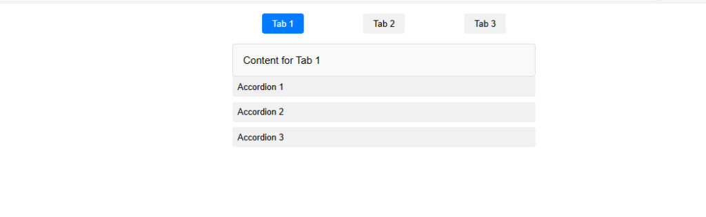
Now, let’s integrate both the tab and accordion HTML structure together. Here’s the updated HTML file that includes both the tabs and the accordion:
<!DOCTYPE html>
<html lang="en">
<head>
    <meta charset="UTF-8">
    <meta name="viewport" content="width=device-width, initial-scale=1.0">
    <title>Tabs and Accordions</title>
    <link rel="stylesheet" href="styles.css">
</head>
<body>
    <div class="tab-container">
        <div class="tab-buttons">
            <button class="tab-button active" data-tab="tab1">Tab 1</button>
            <button class="tab-button" data-tab="tab2">Tab 2</button>
            <button class="tab-button" data-tab="tab3">Tab 3</button>
        </div>
        <div class="tab-content active" id="tab1">Content for Tab 1</div>
        <div class="tab-content" id="tab2">Content for Tab 2</div>
        <div class="tab-content" id="tab3">Content for Tab 3</div>
    </div>

    <div class="accordion-container">
        <div class="accordion-item">
            <button class="accordion-button">Accordion 1</button>
            <div class="accordion-content">
                <p>Content for Accordion 1</p>
            </div>
        </div>
        <div class="accordion-item">
            <button class="accordion-button">Accordion 2</button>
            <div class="accordion-content">
                <p>Content for Accordion 2</p>
            </div>
        </div>
        <div class="accordion-item">
            <button class="accordion-button">Accordion 3</button>
            <div class="accordion-content">
                <p>Content for Accordion 3</p>
            </div>
        </div>
    </div>

    <script src="scripts.js"></script>
</body>
</html>
And here is the combined CSS:
* {
    box-sizing: border-box;
}

body {
    font-family: Arial, sans-serif;
    margin: 0;
    padding: 20px;
}

.tab-container {
    width: 100%;
    max-width: 600px;
    margin: auto;
}

.tab-buttons {
    display: flex;
    justify-content: space-around;
    margin-bottom: 20px;
}

.tab-button {
    padding: 10px 20px;
    cursor: pointer;
    background-color: #f1f1f1;
    border: none;
    border-radius: 5px;
    outline: none;
}

.tab-button.active {
    background-color: #007bff;
    color: white;
}

.tab-content {
    display: none;
    padding: 20px;
    border: 1px solid #ddd;
    border-radius: 5px;
    background-color: #f9f9f9;
}

.tab-content.active {
    display: block;
}

.accordion-container {
    width: 100%;
    max-width: 600px;
    margin: auto;
}

.accordion-item {
    margin-bottom: 10px;
}

.accordion-button {
    width: 100%;
    padding: 10px;
    cursor: pointer;
    background-color: #f1f1f1;
    border: none;
    border-radius: 5px;
    outline: none;
    text-align: left;
}

.accordion-content {
    display: none;
    padding: 10px;
    border: 1px solid #ddd;
    border-radius: 5px;
    background-color: #f9f9f9;
}
And here is the combined JavaScript:
document.addEventListener('DOMContentLoaded', () => {
    // Tab functionality
    const tabButtons = document.querySelectorAll('.tab-button');
    const tabContents = document.querySelectorAll('.tab-content');

    tabButtons.forEach(button => {
        button.addEventListener('click', () => {
            tabButtons.forEach(btn => btn.classList.remove('active'));
            tabContents.forEach(content => content.classList.remove('active'));

            button.classList.add('active');
            document.getElementById(button.getAttribute('data-tab')).classList.add('active');
        });
    });

    // Accordion functionality
    const accordionButtons = document.querySelectorAll('.accordion-button');

    accordionButtons.forEach(button => {
        button.addEventListener('click', () => {
            const content = button.nextElementSibling;
            if (content.style.display === 'block') {
                content.style.display = 'none';
            } else {
                document.querySelectorAll('.accordion-content').forEach(content => content.style.display = 'none');
                content.style.display = 'block';
            }
        });
    });
});
This combined setup allows you to have both tabs and accordions on the same webpage, making it a versatile and organized way to present content to users.
Here’s the result!
Conclusion
By following this guide, you can create functional tabs and accordions using HTML, CSS, and JavaScript. These components help organize content and improve user experience on your website. Feel free to customize and expand upon this basic implementation to suit your specific needs.
How to create image Galleries with Lightbox effect using JavaScript
About the Author