box shadows in css
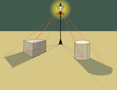
The box shadow property in CSS is used to cast shadow on the frame of elements.
It has the following syntax:
-webkit-box-shadow /* Safari, iOS */
-moz-box-shadow /* Firefox */
box-shadow /* Opera, IE, Chrome */
box-shadow: [horizontal offset] [vertical offset] [blur radius] [optional spread radius] [color]
- The Horizontal Offset (required): The horizontal offset gives the position of the shadow on the horizontal axis. A positive value means the shadow will on the right of the box, while a negative offset will put the shadow on the left of the box.
- The Vertical Offset (required): The vertical offset gives the position of the shadow on the vertical axis. A negative value means the shadow will be above the box, while a positive value means the shadow will be below the box.
- The Blur Radius (required): The blur radius specifies the blur size. If set to zero (0), the shadow will be sharp. The higher the number, the more blurred the shadow and the further out the shadow will extend.
- The Spread Radius (optional): The spread radius increases or decreases the size of the shadow. A positive value will increase the size of the shadow, while a negative value will decrease the size of the shadow. If no value is specified, the default is zero (0), which means that the shadow will be as the same size of the blur.
- Colour (required): This sets the colour of the shadow. It can take a variety of colour types like named, hex, rgba or hsla. If the colour specification is omitted, the shadow will take the foreground colour as its default colour.
THE END

Latest tech news and coding tips.


