As design concepts continually evolve, there, at some point in this our evolving design journey, arises the need to sit back and re-evaluate some of the practices and norms of our highly esteemed design culture. One of these is the constant need for a user to confirm his password.
And I get it, there are strong opinions on this topic. In fact, one could argue that it prevents the user from mistyping unintended password characters and subsequently increases calls to customer support for password revalidation.
Another group could argue that most people generally copy and paste their passwords, and so that they could easily use the reset button. And that argument is legit as well.
But first, let us examine the goal of every registration form, which we believe is to actually get users to register, that is to follow through the process and ultimately become a member of whatever is being offered.
Reports have actually shown that most forms are abandoned at the “Confirm Password” stage. In fact reports show that there was a 56.3% increase in form conversions by just removing “Confirm Password” which did not negatively impact on the password reset rate.
Another annoying trend that users face is that if ever there is a form error, the password field gets cleared out, forcing the user to go through the same process again. That in itself is both frustrating and infuriating.
What could be a better solution to this age-long practice?
Toggle Password Visibility

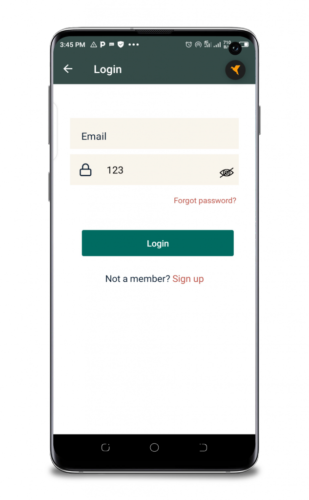
Including a “toggle password” visibility button seems sensible, occupies less space and unmasks the password field.
Since the password field is automatically masked by default, a masking and unmasking button seems reasonable. Users can have the option of seeing their passwords first before deciding to hit the submit button.
The toggle password visibility makes the registration process seamless and less time consuming for the user. The user is encouraged to move on with the registration process.
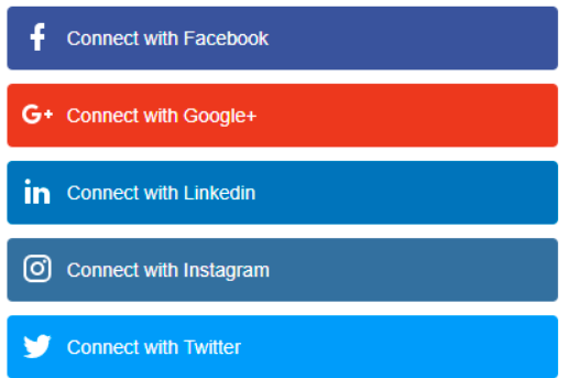
Use Social Logins

Let’s face it: if your mobile or web app is new on the scene, people will trust it less than already established ones like Google or Facebook.
This means that a better solution would mean to not have any passwords at all.
The technical users (I mean most people that use MacOS) of your app will typically use a password generator mechanism, while the others will probably stick to their favourite or less cognitively demanding password combinations, which co-incidentally they use for many different sites/apps.
Integrating with an authentication system that they already use seem plausible.
Conclusion
Whether you choose to use the confirm password field, use a toggle visibility button or some form of social login, you should have one consistent end goal in mind and that is conversion. You should aim for a high conversion rate.
If you, however, do choose to require the user to provide a new password to your application then it is best not to clear the password field whenever there is a form entry error.
You should find a mechanism to gracefully handle form errors and not put the users through form refill hell.
Don’t Build Mobile Apps From Scratch

Latest tech news and coding tips.


