Download the Codeflare iOS app and learn on the Go
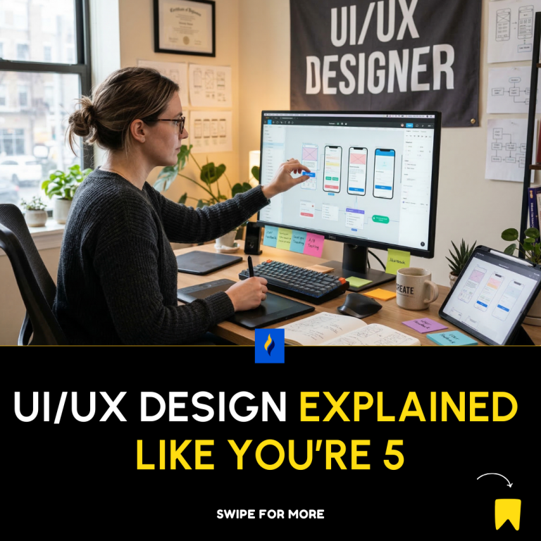
1. What UI and UX Mean
- UI (User Interface) = What people see and click
Example: buttons, menus, colors, layout. - UX (User Experience) = How easy and enjoyable it is to use something.
Download the Codeflare Android App and Learn on the Go.
Think of it like a restaurant:
- UI = the table, menu design, plates
- UX = how easy it is to order, eat, and leave happy
Good UI + Good UX = Happy users.
The Basic Design Process
1. Start With Sketching
Before touching software, draw rough ideas on paper.
Why?
- Fast
- Cheap
- Easy to change
Just sketch boxes representing screens.
Example:
[Logo]

[Menu]

[Big Image]

[Button]
2. Look For Inspiration
Designers rarely start from nothing.
Look at:
- apps
- websites
- design galleries
Ask:
- What works well?
- What looks confusing?
Then improve it.
3. Plan User Flows
A User Flow shows the steps a user takes.
Example:
Open App
   ↓
Sign Up
   ↓
Create Profile
   ↓
Start Using App
If this flow is confusing → users leave.
4. Create a Sitemap
A Sitemap is a map of all pages.
Example:
Home
 ├── About
 ├── Products
 │     ├── Product 1
 │     └── Product 2
 └── Contact
It helps organize the website.
Design Development Stages
1. Low Fidelity
Very rough design.
Looks like:
[Image]
[Text]
[Button]
Goal: structure only
2. High Fidelity
Detailed design with:
- colors
- fonts
- images
- spacing
Goal: looks like the real product
3. Wireframes
Wireframes are blueprints.
They show:
- layout
- structure
- placement of elements
But no styling.
Example:
-------------------
| Logo | Menu     |
-------------------
|     Image       |
-------------------
|     Button      |
-------------------
4. Prototypes
A prototype is a fake working version.
You can:
- click buttons
- move between screens
- simulate the app
It helps test ideas before building.
Important Design Principles
1. Grid System
A grid helps align everything neatly.
Example:
|  |  |  |  |
|  |  |  |  |
|  |  |  |  |
Benefits:
- clean layout
- consistency
- easier design
2. Layout
Layout = how things are arranged on screen.
Good layout:
- clear
- balanced
- easy to read
Bad layout = chaos.
3. Color
Colors affect emotions.
Examples:
- Blue → trust
- Red → urgency
- Green → success
Rules:
- use few colors
- keep consistency
- ensure contrast
4. Typography (Fonts)
Fonts must be:
- readable
- consistent
- not too many
Usually:
- 1 font for headings
- 1 font for body text
5. Motion & Micro-Interactions
Small animations that improve experience.
Examples:
- button ripple when clicked
- loading animation
- hover effects
These make apps feel alive.
6. Accessibility
Design so everyone can use it, including people with disabilities.
Examples:
- readable fonts
- color contrast
- screen reader support
Good design includes everyone.
Mobile Design Rules
Phones have:
- small screens
- touch input
So designs must have:
✔ big buttons
✔ simple layouts
✔ fast loading
Design Patterns
These are common solutions designers reuse.
Examples:
- hamburger menu
- search bar
- login form
- card layout
Users already understand them.
Design Systems
A Design System is a rulebook for design.
It contains:
- colors
- buttons
- fonts
- spacing
- components
Example:
Primary Button
Secondary Button
Text Field
Card Layout
This keeps everything consistent.
The Simplest UI/UX Formula
Understand Users
      ↓
Sketch Ideas
      ↓
Plan Flow
      ↓
Create Wireframes
      ↓
Build Prototype
      ↓
Test With Users
      ↓
Improve
Repeat until it feels great.
The One Golden Rule of UI/UX
If users have to think too much, the design is bad.
Good design should feel obvious and effortless.
If you want, I can also give you a 1-page UI/UX cheat sheet designers memorize (the real practical rules used by top designers). It’s much more powerful than the PDF.
About the Author

Latest tech news and coding tips.