The select dropdown feature is useful for presenting users with a list of predefined options which they can select from.
To achieve this in React Native, we make use of the react-native-select-dropdown
The react-native-select-dropdown is a highly customized dropdown | select | picker | menu for react native that works for andriod and iOS platforms.
First, we install this dependency in our application.
yarn add react-native-select-dropdownThen we can use in any of the following ways:
import React from 'react';
import {View, Text, SafeAreaView, StatusBar, Dimensions, StyleSheet, ScrollView, Image} from 'react-native';
const {width} = Dimensions.get('window');
import FontAwesome from 'react-native-vector-icons/FontAwesome';
import Ionicons from 'react-native-vector-icons/Ionicons';
import SelectDropdown from 'react-native-select-dropdown';

export default Demo1 = () => {
  const countries = [
    'Egypt',
    'Canada',
    'Australia',
    'Ireland',
    'Brazil',
    'England',
    'Dubai',
    'France',
    'Germany',
    'Saudi Arabia',
    'Argentina',
    'India',
  ];
  const countriesWithFlags = [
    {title: 'Egypt', image: require('./Images/Egypt.png')},
    {title: 'Canada', image: require('./Images/Canada.png')},
    {title: 'Australia', image: require('./Images/Australia.png')},
    {title: 'Ireland', image: require('./Images/Ireland.png')},
    {title: 'Brazil', image: require('./Images/Brazil.png')},
    {title: 'England', image: require('./Images/England.jpg')},
    {title: 'Dubai', image: require('./Images/Dubai.png')},
  ];

  const renderHeader = () => {
    return (
      <View style={[styles.header, styles.shadow]}>
        <Text style={styles.headerTitle}>{'Demo 1'}</Text>
      </View>
    );
  };

  return (
    <SafeAreaView style={styles.saveAreaViewContainer}>
      <StatusBar backgroundColor="#FFF" barStyle="dark-content" />
      <View style={styles.viewContainer}>
        {renderHeader()}
        <ScrollView
          showsVerticalScrollIndicator={false}
          alwaysBounceVertical={false}
          contentContainerStyle={styles.scrollViewContainer}>
          <SelectDropdown
            data={countries}
            // defaultValueByIndex={1} // use default value by index or default value
            // defaultValue={'Canada'} // use default value by index or default value
            onSelect={(selectedItem, index) => {
              console.log(selectedItem, index);
            }}
            buttonTextAfterSelection={(selectedItem, index) => {
              return selectedItem;
            }}
            rowTextForSelection={(item, index) => {
              return item;
            }}
          />

          <SelectDropdown
            data={countries}
            // defaultValueByIndex={1}
            // defaultValue={'Egypt'}
            onSelect={(selectedItem, index) => {
              console.log(selectedItem, index);
            }}
            defaultButtonText={'Select country'}
            buttonTextAfterSelection={(selectedItem, index) => {
              return selectedItem;
            }}
            rowTextForSelection={(item, index) => {
              return item;
            }}
            buttonStyle={styles.dropdown1BtnStyle}
            buttonTextStyle={styles.dropdown1BtnTxtStyle}
            renderDropdownIcon={isOpened => {
              return <FontAwesome name={isOpened ? 'chevron-up' : 'chevron-down'} color={'#444'} size={18} />;
            }}
            dropdownIconPosition={'right'}
            dropdownStyle={styles.dropdown1DropdownStyle}
            rowStyle={styles.dropdown1RowStyle}
            rowTextStyle={styles.dropdown1RowTxtStyle}
          />

          <SelectDropdown
            data={countries}
            // defaultValueByIndex={1}
            // defaultValue={'England'}
            onSelect={(selectedItem, index) => {
              console.log(selectedItem, index);
            }}
            defaultButtonText={'Select country'}
            buttonTextAfterSelection={(selectedItem, index) => {
              return selectedItem;
            }}
            rowTextForSelection={(item, index) => {
              return item;
            }}
            buttonStyle={styles.dropdown2BtnStyle}
            buttonTextStyle={styles.dropdown2BtnTxtStyle}
            renderDropdownIcon={isOpened => {
              return <FontAwesome name={isOpened ? 'chevron-up' : 'chevron-down'} color={'#FFF'} size={18} />;
            }}
            dropdownIconPosition={'right'}
            dropdownStyle={styles.dropdown2DropdownStyle}
            rowStyle={styles.dropdown2RowStyle}
            rowTextStyle={styles.dropdown2RowTxtStyle}
          />

          <SelectDropdown
            data={countriesWithFlags}
            // defaultValueByIndex={1}
            // defaultValue={{
            //   title: 'England',
            //   image: require('./Images/England.jpg'),
            // }}
            onSelect={(selectedItem, index) => {
              console.log(selectedItem, index);
            }}
            buttonStyle={styles.dropdown3BtnStyle}
            renderCustomizedButtonChild={(selectedItem, index) => {
              return (
                <View style={styles.dropdown3BtnChildStyle}>
                  {selectedItem ? (
                    <Image source={selectedItem.image} style={styles.dropdown3BtnImage} />
                  ) : (
                    <Ionicons name="md-earth-sharp" color={'#444'} size={32} />
                  )}
                  <Text style={styles.dropdown3BtnTxt}>{selectedItem ? selectedItem.title : 'Select country'}</Text>
                  <FontAwesome name="chevron-down" color={'#444'} size={18} />
                </View>
              );
            }}
            dropdownStyle={styles.dropdown3DropdownStyle}
            rowStyle={styles.dropdown3RowStyle}
            renderCustomizedRowChild={(item, index) => {
              return (
                <View style={styles.dropdown3RowChildStyle}>
                  <Image source={item.image} style={styles.dropdownRowImage} />
                  <Text style={styles.dropdown3RowTxt}>{item.title}</Text>
                </View>
              );
            }}
          />

          <SelectDropdown
            data={countriesWithFlags}
            // defaultValueByIndex={1}
            // defaultValue={'India'}
            onSelect={(selectedItem, index) => {
              console.log(selectedItem, index);
            }}
            defaultButtonText={'Select country'}
            buttonTextAfterSelection={(selectedItem, index) => {
              return selectedItem.title;
            }}
            rowTextForSelection={(item, index) => {
              return item.title;
            }}
            buttonStyle={styles.dropdown4BtnStyle}
            buttonTextStyle={styles.dropdown4BtnTxtStyle}
            renderDropdownIcon={isOpened => {
              return <FontAwesome name={isOpened ? 'chevron-up' : 'chevron-down'} color={'#444'} size={18} />;
            }}
            dropdownIconPosition={'left'}
            dropdownStyle={styles.dropdown4DropdownStyle}
            rowStyle={styles.dropdown4RowStyle}
            rowTextStyle={styles.dropdown4RowTxtStyle}
          />
        </ScrollView>
      </View>
    </SafeAreaView>
  );
};

const styles = StyleSheet.create({
  shadow: {
    shadowColor: '#000',
    shadowOffset: {width: 0, height: 6},
    shadowOpacity: 0.1,
    shadowRadius: 10,
    elevation: 10,
  },
  header: {
    flexDirection: 'row',
    width,
    height: 50,
    alignItems: 'center',
    justifyContent: 'center',
    backgroundColor: '#F6F6F6',
  },
  headerTitle: {color: '#000', fontWeight: 'bold', fontSize: 16},
  saveAreaViewContainer: {flex: 1, backgroundColor: '#FFF'},
  viewContainer: {flex: 1, width, backgroundColor: '#FFF'},
  scrollViewContainer: {
    flexGrow: 1,
    justifyContent: 'space-between',
    alignItems: 'center',
    paddingVertical: '10%',
    paddingBottom: '20%',
  },

  dropdown1BtnStyle: {
    width: '80%',
    height: 50,
    backgroundColor: '#FFF',
    borderRadius: 8,
    borderWidth: 1,
    borderColor: '#444',
  },
  dropdown1BtnTxtStyle: {color: '#444', textAlign: 'left'},
  dropdown1DropdownStyle: {backgroundColor: '#EFEFEF'},
  dropdown1RowStyle: {backgroundColor: '#EFEFEF', borderBottomColor: '#C5C5C5'},
  dropdown1RowTxtStyle: {color: '#444', textAlign: 'left'},

  dropdown2BtnStyle: {
    width: '80%',
    height: 50,
    backgroundColor: '#444',
    borderRadius: 8,
  },
  dropdown2BtnTxtStyle: {
    color: '#FFF',
    textAlign: 'center',
    fontWeight: 'bold',
  },
  dropdown2DropdownStyle: {
    backgroundColor: '#444',
    borderBottomLeftRadius: 12,
    borderBottomRightRadius: 12,
  },
  dropdown2RowStyle: {backgroundColor: '#444', borderBottomColor: '#C5C5C5'},
  dropdown2RowTxtStyle: {
    color: '#FFF',
    textAlign: 'center',
    fontWeight: 'bold',
  },

  dropdown3BtnStyle: {
    width: '80%',
    height: 50,
    backgroundColor: '#FFF',
    paddingHorizontal: 0,
    borderWidth: 1,
    borderRadius: 8,
    borderColor: '#444',
  },
  dropdown3BtnChildStyle: {
    flex: 1,
    flexDirection: 'row',
    justifyContent: 'space-between',
    alignItems: 'center',
    paddingHorizontal: 18,
  },
  dropdown3BtnImage: {width: 45, height: 45, resizeMode: 'cover'},
  dropdown3BtnTxt: {
    color: '#444',
    textAlign: 'center',
    fontWeight: 'bold',
    fontSize: 24,
    marginHorizontal: 12,
  },
  dropdown3DropdownStyle: {backgroundColor: 'slategray'},
  dropdown3RowStyle: {
    backgroundColor: 'slategray',
    borderBottomColor: '#444',
    height: 50,
  },
  dropdown3RowChildStyle: {
    flex: 1,
    flexDirection: 'row',
    justifyContent: 'flex-start',
    alignItems: 'center',
    paddingHorizontal: 18,
  },
  dropdownRowImage: {width: 45, height: 45, resizeMode: 'cover'},
  dropdown3RowTxt: {
    color: '#F1F1F1',
    textAlign: 'center',
    fontWeight: 'bold',
    fontSize: 24,
    marginHorizontal: 12,
  },

  dropdown4BtnStyle: {
    width: '50%',
    height: 50,
    backgroundColor: '#FFF',
    borderRadius: 8,
    borderWidth: 1,
    borderColor: '#444',
  },
  dropdown4BtnTxtStyle: {color: '#444', textAlign: 'left'},
  dropdown4DropdownStyle: {backgroundColor: '#EFEFEF'},
  dropdown4RowStyle: {backgroundColor: '#EFEFEF', borderBottomColor: '#C5C5C5'},
  dropdown4RowTxtStyle: {color: '#444', textAlign: 'left'},
});
To use the dropdown icon, you need to add react-native-vector-icons to your project.
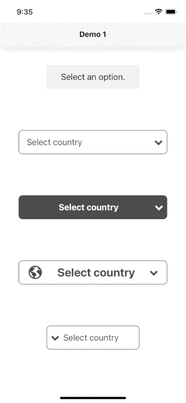
Result:
See Also
How to use Google Places Autocomplete Search in React Native