Tooltips and hover effects are indispensable elements in contemporary web design, enriching user experiences by offering supplementary information and bolstering website interactivity. In this comprehensive article, we delve into a detailed JavaScript tooltips and hover effects tutorial, leveraging the synergy of CSS and HTML. By following our step-by-step guidance, you’ll learn to implement tooltips that dynamically display information on hover, enhancing usability and engagement. This tutorial empowers you to customize tooltips with various styles and effects, ensuring they seamlessly integrate into your website’s design aesthetic and functionality requirements.
1. Setting Up Your HTML Structure
First, we’ll create a simple HTML structure that includes elements to which we’ll add tooltips and hover effects.
<!DOCTYPE html>
<html lang="en">
<head>
<meta charset="UTF-8">
<meta name="viewport" content="width=device-width, initial-scale=1.0">
<title>Tooltip and Hover Effects</title>
<link rel="stylesheet" href="styles.css">
</head>
<body>
<div class="container">
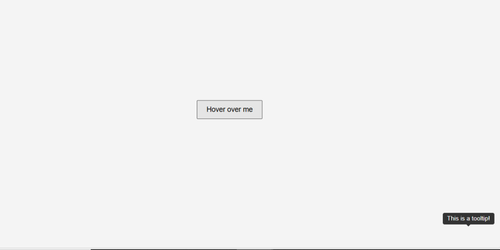
<button class="tooltip-target" data-tooltip="This is a tooltip!">Hover over me</button>
</div>
<script src="scripts.js"></script>
</body>
</html>
2. Styling with CSS
Next, we need to add some CSS to style our tooltips and hover effects.
/* styles.css */
body {
    font-family: Arial, sans-serif;
    display: flex;
    justify-content: center;
    align-items: center;
    height: 100vh;
    margin: 0;
    background-color: #f4f4f4;
}

.container {
    position: relative;
    display: inline-block;
}

.tooltip-target {
    padding: 10px 20px;
    font-size: 16px;
    cursor: pointer;
}

.tooltip {
    position: absolute;
    background-color: #333;
    color: #fff;
    padding: 5px 10px;
    border-radius: 4px;
    font-size: 14px;
    display: none;
    z-index: 1000;
    white-space: nowrap;
}

.tooltip::after {
    content: '';
    position: absolute;
    border-style: solid;
}

.tooltip.top::after {
    border-width: 5px 5px 0 5px;
    border-color: #333 transparent transparent transparent;
    bottom: -5px;
    left: 50%;
    transform: translateX(-50%);
}

.tooltip.right::after {
    border-width: 5px 5px 5px 0;
    border-color: transparent #333 transparent transparent;
    left: -5px;
    top: 50%;
    transform: translateY(-50%);
}

.tooltip.bottom::after {
    border-width: 0 5px 5px 5px;
    border-color: transparent transparent #333 transparent;
    top: -5px;
    left: 50%;
    transform: translateX(-50%);
}

.tooltip.left::after {
    border-width: 5px 0 5px 5px;
    border-color: transparent transparent transparent #333;
    right: -5px;
    top: 50%;
    transform: translateY(-50%);
}
3. Adding JavaScript Functionality
Finally, we’ll add JavaScript to handle the display and positioning of the tooltips.
// scripts.js
document.addEventListener('DOMContentLoaded', () => {
    const tooltipTargets = document.querySelectorAll('.tooltip-target');

    tooltipTargets.forEach(target => {
        const tooltipText = target.getAttribute('data-tooltip');
        const tooltip = document.createElement('div');
        tooltip.className = 'tooltip top';
        tooltip.innerText = tooltipText;
        target.appendChild(tooltip);

        target.addEventListener('mouseover', () => {
            tooltip.style.display = 'block';
            const targetRect = target.getBoundingClientRect();
            const tooltipRect = tooltip.getBoundingClientRect();

            tooltip.style.left = `${targetRect.left + (targetRect.width / 2) - (tooltipRect.width / 2)}px`;
            tooltip.style.top = `${targetRect.top - tooltipRect.height - 10}px`;
        });

        target.addEventListener('mouseout', () => {
            tooltip.style.display = 'none';
        });
    });
});
Explanation
- HTML: We have a button element with a
data-tooltipattribute that contains the text for the tooltip. - CSS: We style the tooltip with position, background color, and arrow indicators to point to the target element.
- JavaScript:
- We select all elements with the class
tooltip-target. - For each target, we create a tooltip
divand append it to the target element. - We add event listeners to show the tooltip on mouseover and hide it on mouseout.
- The tooltip position is calculated to be centered above the target element.
- We select all elements with the class
Here is the complete code with HTML, CSS, and JavaScript combined:
<!DOCTYPE html>
<html lang="en">
<head>
    <meta charset="UTF-8">
    <meta name="viewport" content="width=device-width, initial-scale=1.0">
    <title>Tooltip and Hover Effects</title>
    <style>
        /* CSS */
        body {
            font-family: Arial, sans-serif;
            display: flex;
            justify-content: center;
            align-items: center;
            height: 100vh;
            margin: 0;
            background-color: #f4f4f4;
        }

        .container {
            position: relative;
            display: inline-block;
        }

        .tooltip-target {
            padding: 10px 20px;
            font-size: 16px;
            cursor: pointer;
        }

        .tooltip {
            position: absolute;
            background-color: #333;
            color: #fff;
            padding: 5px 10px;
            border-radius: 4px;
            font-size: 14px;
            display: none;
            z-index: 1000;
            white-space: nowrap;
        }

        .tooltip::after {
            content: '';
            position: absolute;
            border-style: solid;
        }

        .tooltip.top::after {
            border-width: 5px 5px 0 5px;
            border-color: #333 transparent transparent transparent;
            bottom: -5px;
            left: 50%;
            transform: translateX(-50%);
        }

        .tooltip.right::after {
            border-width: 5px 5px 5px 0;
            border-color: transparent #333 transparent transparent;
            left: -5px;
            top: 50%;
            transform: translateY(-50%);
        }

        .tooltip.bottom::after {
            border-width: 0 5px 5px 5px;
            border-color: transparent transparent #333 transparent;
            top: -5px;
            left: 50%;
            transform: translateX(-50%);
        }

        .tooltip.left::after {
            border-width: 5px 0 5px 5px;
            border-color: transparent transparent transparent #333;
            right: -5px;
            top: 50%;
            transform: translateY(-50%);
        }
    </style>
</head>
<body>
    <!-- HTML -->
    <div class="container">
        <button class="tooltip-target" data-tooltip="This is a tooltip!">Hover over me</button>
    </div>
    <script>
        // JavaScript
        document.addEventListener('DOMContentLoaded', () => {
            const tooltipTargets = document.querySelectorAll('.tooltip-target');

            tooltipTargets.forEach(target => {
                const tooltipText = target.getAttribute('data-tooltip');
                const tooltip = document.createElement('div');
                tooltip.className = 'tooltip top';
                tooltip.innerText = tooltipText;
                target.appendChild(tooltip);

                target.addEventListener('mouseover', () => {
                    tooltip.style.display = 'block';
                    const targetRect = target.getBoundingClientRect();
                    const tooltipRect = tooltip.getBoundingClientRect();

                    tooltip.style.left = `${targetRect.left + (targetRect.width / 2) - (tooltipRect.width / 2)}px`;
                    tooltip.style.top = `${targetRect.top - tooltipRect.height - 10}px`;
                });

                target.addEventListener('mouseout', () => {
                    tooltip.style.display = 'none';
                });
            });
        });
    </script>
</body>
</html>
Here’s the Outcome!
Conclusion
Creating tooltips and hover effects using JavaScript is a straightforward process that enhances the interactivity of your website. It involves utilizing HTML for structure, CSS for styling, and JavaScript for functionality. This JavaScript tooltips and hover effects tutorial will guide you through each step, empowering you to provide users with additional information in a visually appealing manner. Whether you’re highlighting key features, explaining terms, or adding interactive elements, experimenting with different styles and positions allows you to tailor the experience to fit your design preferences and user expectations effectively.
How to create sliders for testimonials or review using JavaScript
About the Author