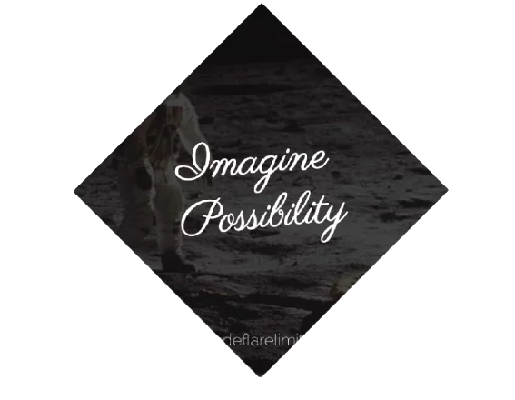
It is very common to see cropped images in diamond shapes in visual design. But is it possible to create a diamond-shaped image in CSS?
In fact, one might think it is impossible, so that when web designers want to follow this style, they more often than not pre-crop their images via an image editor.
But this is really not a maintainable way to apply any effect and ends up being a mess if one wants to change the image styling in the future.
So, we are going to create a diamond-shaped image in CSS
Using CSS transform to Create a Diamond-based Image in CSS
we need to wrap our image with a <div>, then apply opposite rotate() transforms to them:
<div class="picture">
<img src="images/image.png" alt="" />
</div>
Then we apply style as follows:
 .picture{
            display: block;
            margin: 0 auto;
            margin-top: 100px;
            width: 400px;
            transform: rotate(45deg);
            overflow: hidden;
        }
        .picture img{
            max-width: 100%;
            transform: rotate(-45deg) scale(1.42);
        }
The main issue is the max-width: 100% declaration. 100% refers to the side of our .picture container.
However, we want our image to be as wide as its diagonal, not its side. You might have guessed that yes, we need the Pythagorean theorem again as we did when we used Diagonal stripes. As the theorem tells us, the diagonal of a square is equal to its side multiplied by
2 ≈ 1 . 414213562. Therefore, it makes sense to set max-width to
2 × 100 % ≈ 141 . 4213562 %, or round it up to 142%, as we don’t want it to be smaller under any circumstances (but slightly larger is OK, as we’re cropping our image anyway).
Actually, it makes even more sense to enlarge the image through a scale() transform, for a couple of reasons:
We want the size of the image to remain 100% if CSS transforms are not supported.
Enlarging an image through a scale() transform will scale it from the center (unless a different transform-origin is specified). Enlarging it via its width property will scale it from the top-left corner, so we will end up having to use negative margins to move it.
Putting it all together, our final code looks like this:
This is how to create a diamond-shaped image in CSS.